Art Access
Museum Companion App for Visual Processing Disorders
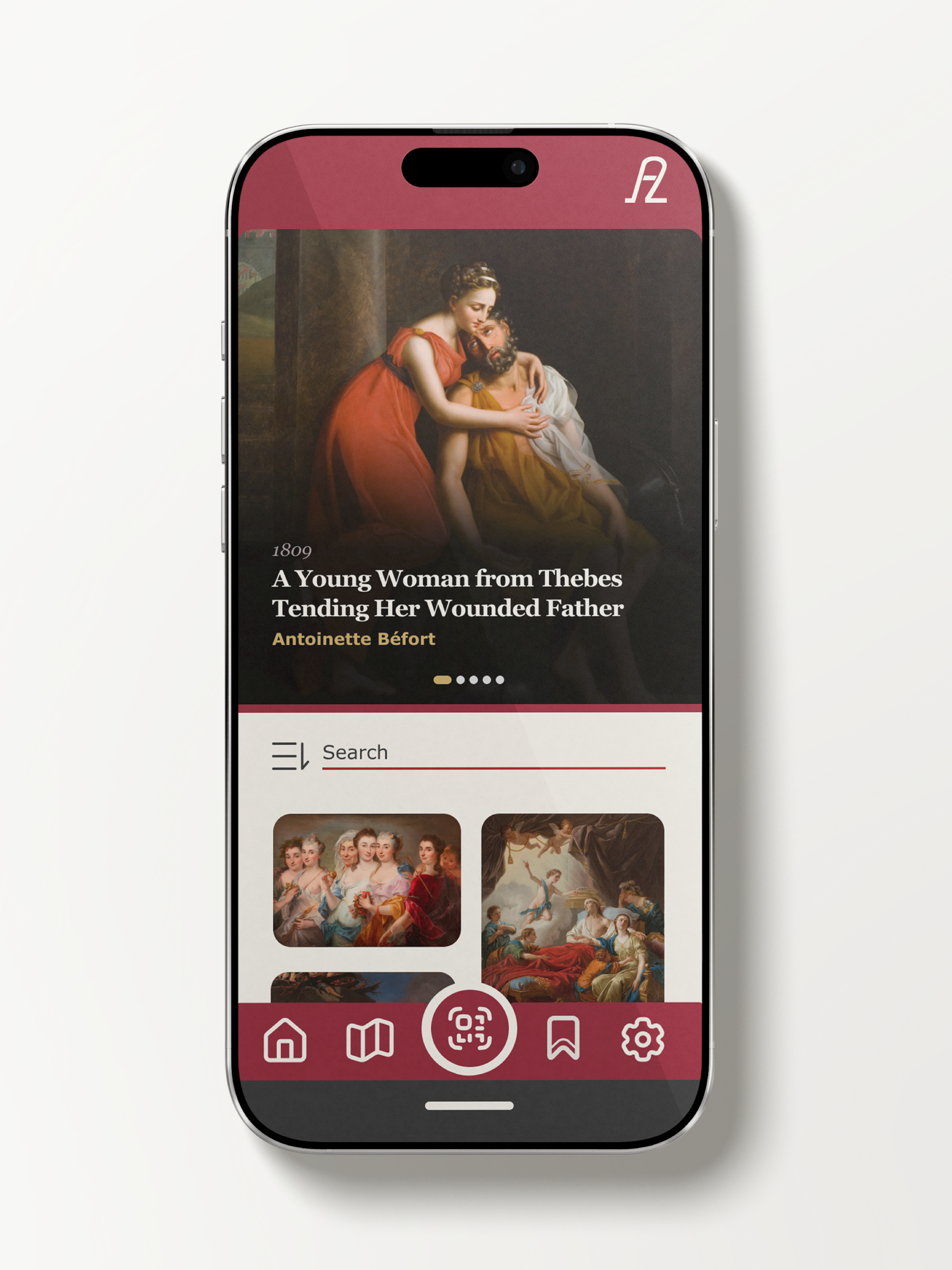
A mobile app designed for the David Owsley Museum of Art that makes viewing artwork accessible to visitors with Visual Processing Disorders through customizable text, reading aids, and zoom features.
Tools Used
The Problem
Visual Processing Disorders can cause a variety of issues for museum visitors, including difficulty with reading comprehension, shape recognition, and viewing complex images. Labels in museums can be difficult to read because of long paragraphs and small type, while art with complex compositions or busy backgrounds can be hard to view for users with VPD. The David Owsley Museum of Art needs a digital solution to make their collection more accessible to all visitors, particularly those with visual processing challenges.
What is Visual Processing Disorder?
"A visual processing disorder is not a physical disability of the eye, but a deficit in the brain's ability to identify, organize and process information."
—The Center for Vision Development
The Solution
Art Access provides customizable accessibility features including a unique reading ruler to isolate text, adjustable font sizes and spacing, high contrast modes, and artwork zoom capabilities. The app allows visitors to customize their viewing experience to suit their individual needs.
Understanding Visual Processing Disorders
Research into the challenges faced by museum visitors with VPD
Reading Difficulties
- •Long paragraphs with small type are hard to read
- •Difficulty discriminating between certain letters
- •Easily distracted by surrounding visual information
Visual Processing Issues
- •Complex compositions are overwhelming
- •Busy backgrounds make artwork difficult to view
- •Identifying and distinguishing shapes is challenging
Design Goals
Adjustable Text
Customizable size, spacing, and contrast
Reading Ruler
Isolate one line of text at a time
Zoom Features
View artwork details up close
Design Process
Research
Studied Visual Processing Disorders and analyzed existing accessibility tools to find gaps in museum-specific solutions.
Wireframes
Created low-fidelity wireframes to experiment with laoyout options and placement of accessibility controls.
High-Fidelity Design
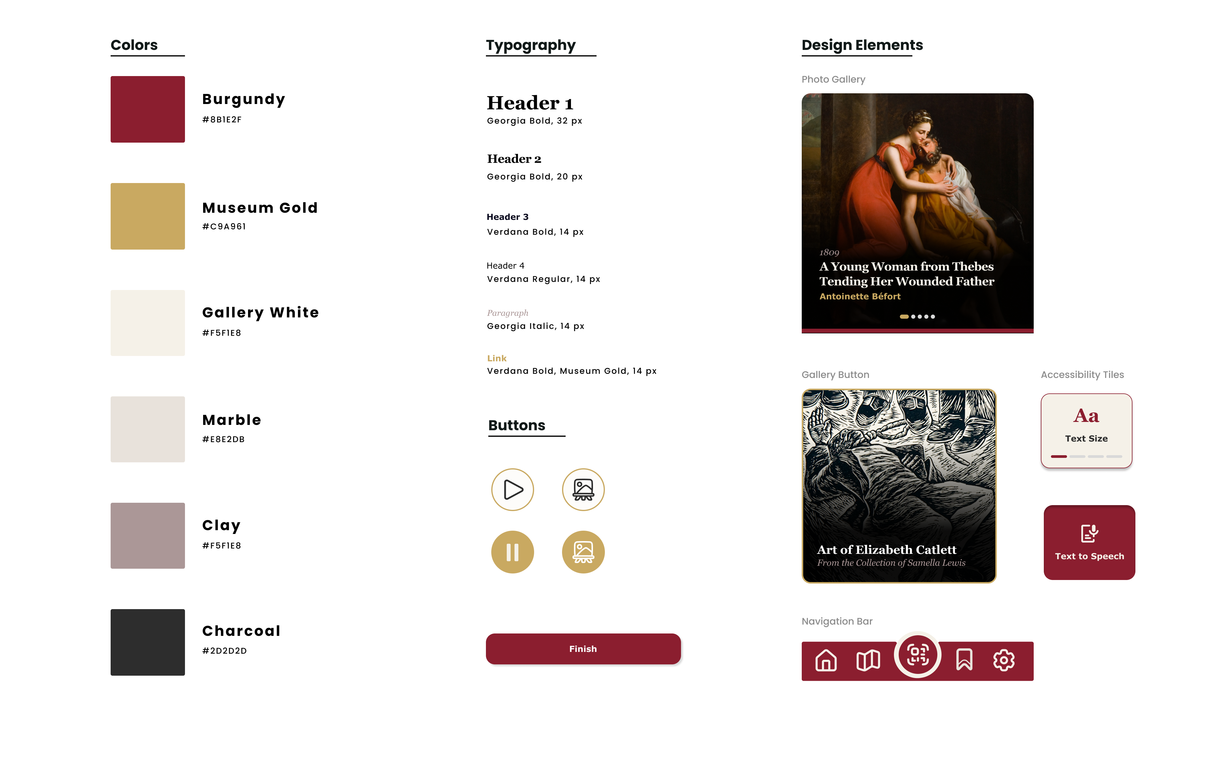
Developed a style guide to ensure ADA-compliant colors and consistent components.
Sitemap
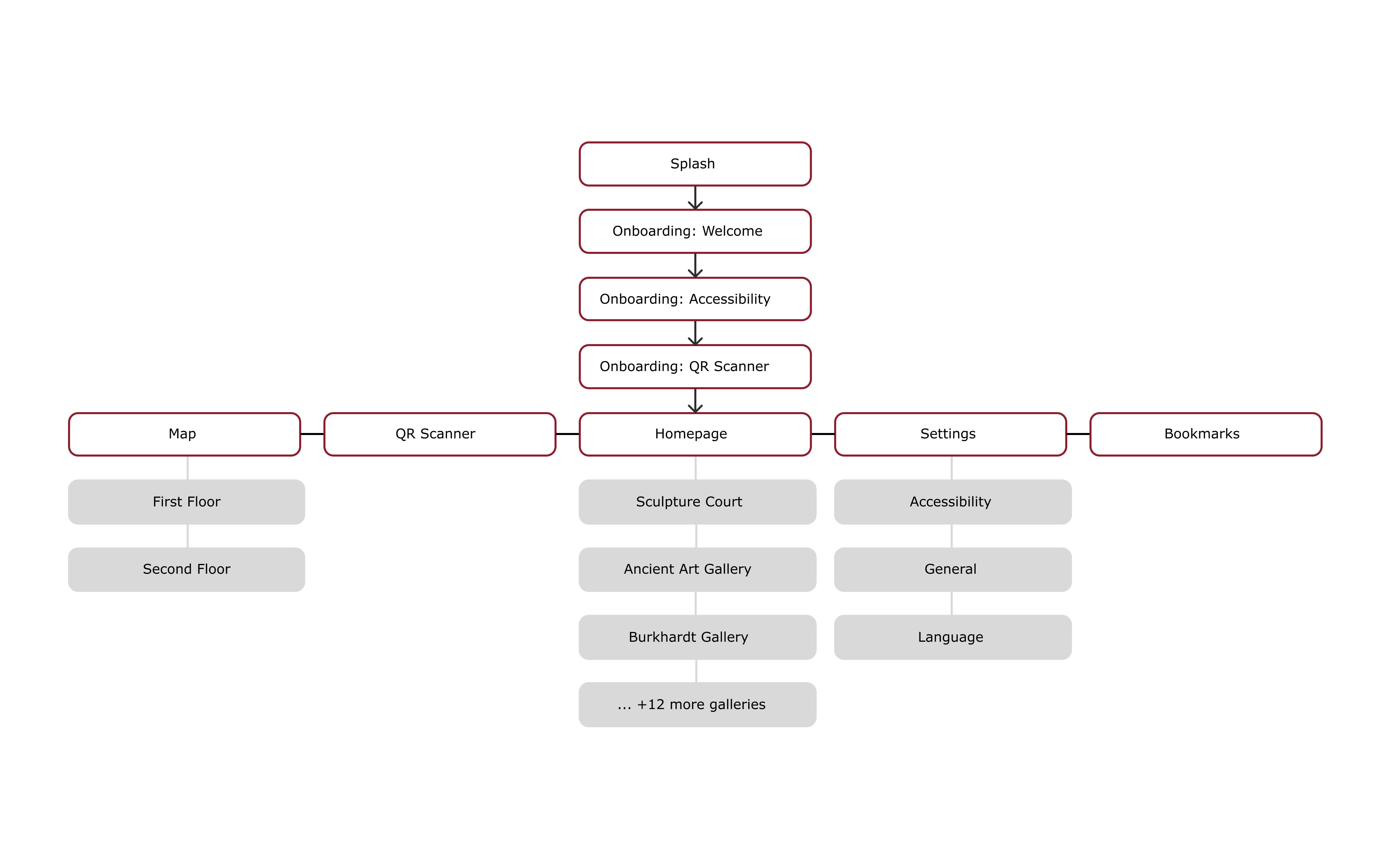
The app structure was designed to provide intuititve navigation, with clear paths to accessibility features and simple access to artwork information.
User Flows
Mapping the key user journeys through the app, from first-time users, to browsing artwork, to adjusting accessibility settings.

First-Time User Journey
Wireframes
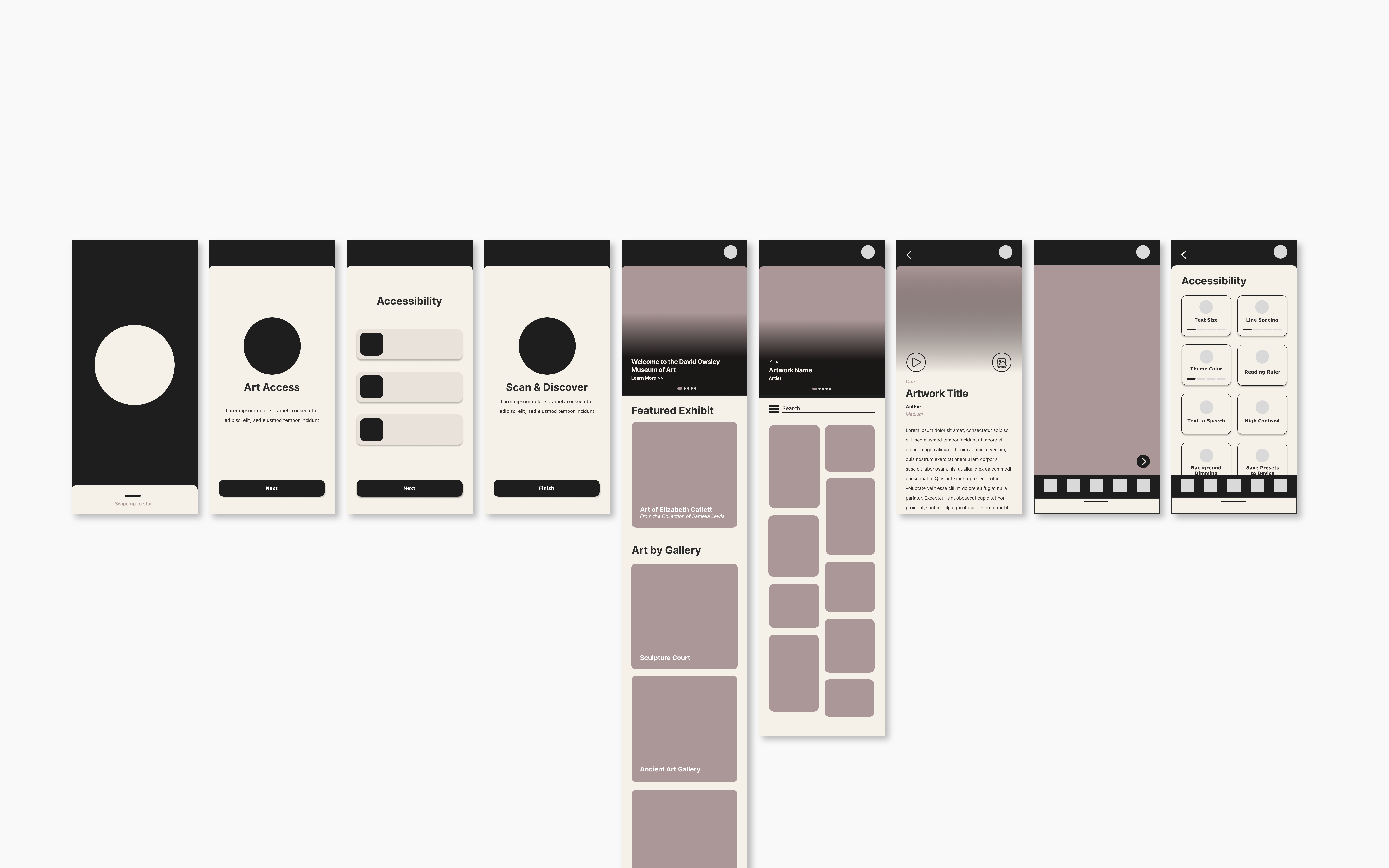
Low-fidelity wireframes helped me explore different layout options and test the placement of accessibility controls before committing to a final design.
Style Guide
A comprehensive style guide built with accessibility at its core, featuring ADA-compliant color contrast ratios, clear typography, and consistent component design.
Key Features
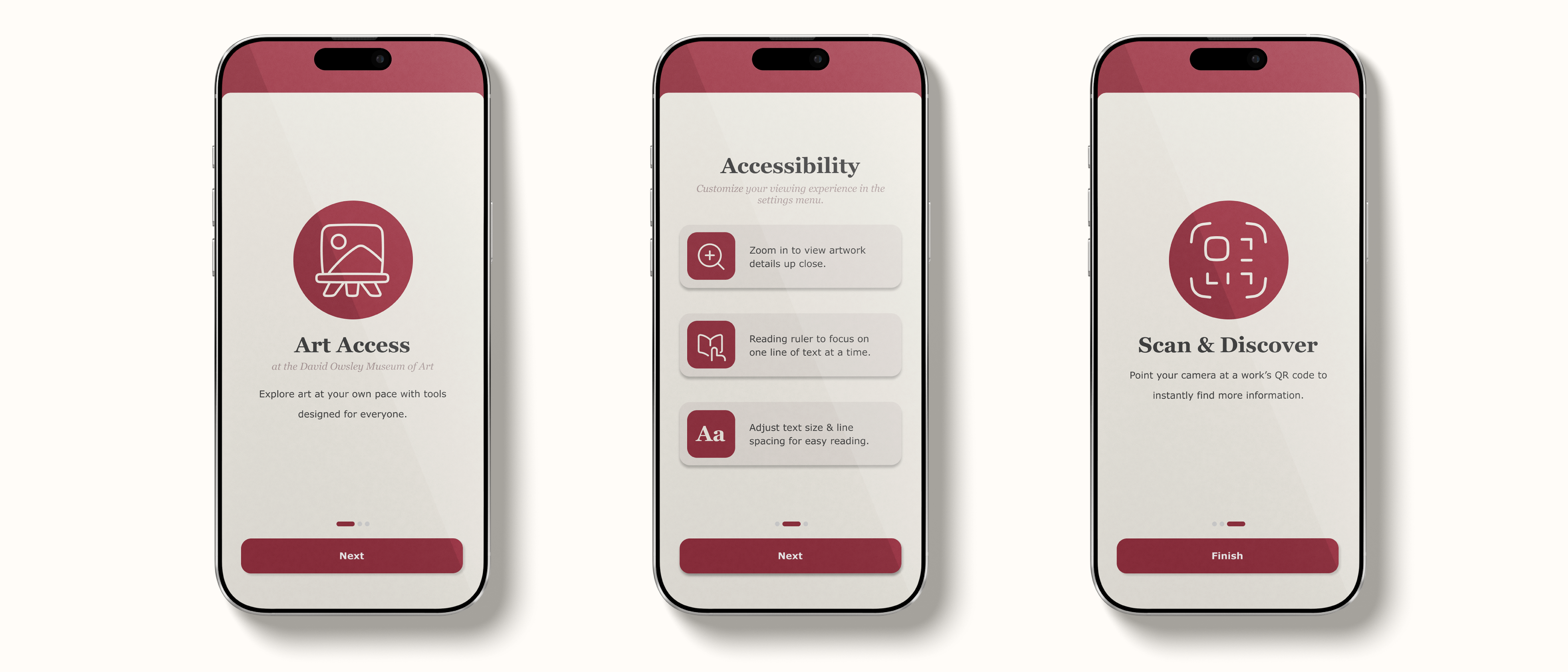
Onboarding Experience
Introduction to accessibility features from the start, helping users understand how the app can be customized to their needs.
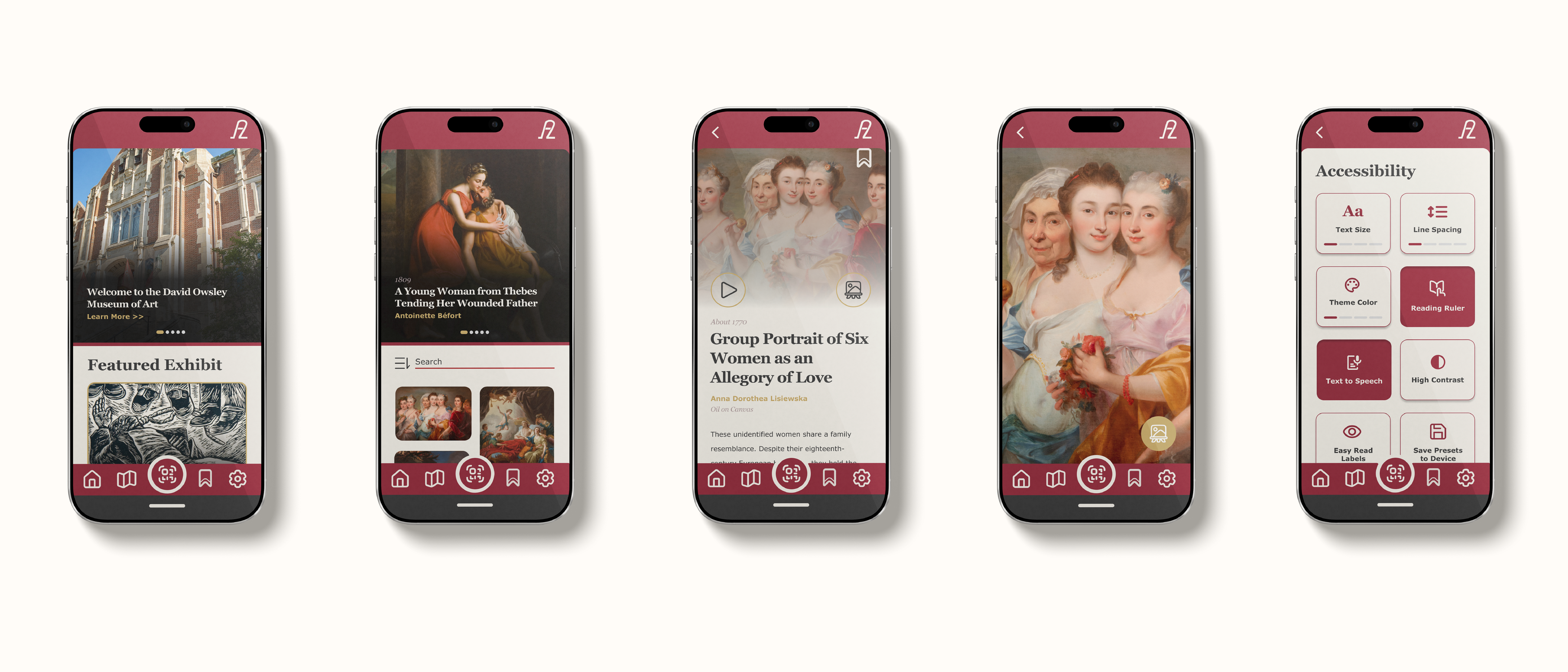
Accessibility Controls
Comprehensive accessibility menu with text size, line spacing, reading ruler, text-to-speech, high contrast mode, and the ability to save custom presets.
Exploring accessibility features
Navigating to artwork, using reading ruler and zoom
Artwork Viewing & Zoom
Browse galleries, view detailed artwork information, and zoom in to see fine details up close.
Key Takeaways
This project taught me the importance of designing for specific accessibility needs rather than generic solutions. By focusing on Visual Processing Disorders, I was able to create an app that allows the user to customize their experience to their own needs.
Accessibility First
Learned that effective accessibility requires understanding specific user needs, not one-size-fits-all solutions
User-Centered Design
Research into VPD challenges informed every design decision, from typography to layout
Design Systems
Created a cohesive style guide that maintains accessibility while preserving visual appeal
Explore More Projects
Check out other projects from my portfolio
© 2025 Maddie Whitaker · Built from scratch with Next.js & Tailwind CSS
Indianapolis, IN